Finastra Design System
Welcome to the home for next generation implementation of our design system. It includes a theme built over custom properties and a web components' implementation of our UI kit. We are still in beta so expect regular changes in components' structure and parameters.

- + 15
App bar
6
App Card
8
Autocomplete
5
Avatar
7
Base card
2
Brand card
6
Button Toggle
2
Button Toggle Group
5
Card
3
Checkbox
3
Chip
7
Circular Progress
2
Color
2
Contained
5
Divider
5
Elevation
1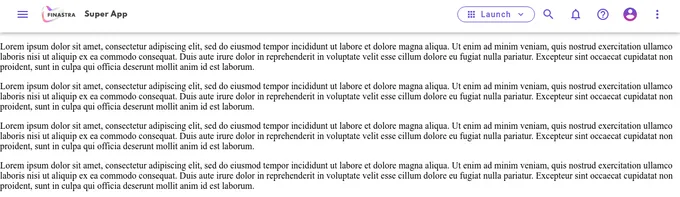
Global Nav
5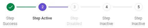
Horizontal
1
Launchpad
2
Linear Progress
2Addons in this project
Actions
Get UI feedback when an action is performed on an interactive element
5.4M
Downloads
- + 8
Links
Link stories together to build demos and prototypes with your UI components
4.2M
Downloads
- + 8
Accessibility
Test component compliance with web accessibility standards
1.6M
Downloads
- + 8
storybook-dark-mode
Toggle between light and dark mode in Storybook
268k
Downloads
Designs
Storybook addon for embedding your design preview in addon panel
210k
Downloads
CSS Custom Properties
Interact with css custom properties dynamically in the Storybook UI
5.3k
Downloads
Similar projects
Add your project
Web


React-Dates


Europa Component Library


WFP UI-KIT
